A visual signal must be designed in such a way that anyone who sees it can recognise it and is able to react immediately to it. Colours should also contrast with other colours – and even shapes in the same area to make them distinguishable, again, so that they can be immediately understood.
Colour Indicator:
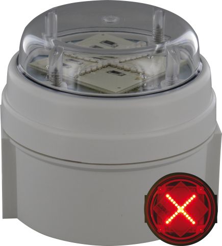
Shape Indicator:
The colours Red/Amber/Green are the most standard form of visual signalling and most people can recognise and relate to each colour. The colours Blue and White give additional levels of indication. In general, these colours mean:
| Colour | Safety Meaning | Condition of Process/ State of Equipment |
| Red | Danger | Emergency/Fault |
| Amber | Warning | Abnormal |
| Green | Safe | Normal |
| Blue | Mandatory significance | |
| White | No specific meaning assigned |
Importantly, the position of each colour is vital. Red should always be at the top, Amber middle and Green at the bottom. This is because a person may be colour blind and so will not be able to recognise the colour but will know by the position of the light what it signals.
Alternatively colours and shapes may be used to signify the above table, this is again because as above, a person may be colour blind and so not be able to recognise colour only.
Colours and flashing lights are the most effective means of attracting attention, and so need to be applied consistently; colours for priority and flashing for attracting attention. When two levels of attention are required, two flash speeds can be used: normal for the highest priority signal (84-168 flashes per min) and slow for the lowest priority (24-48 flashes per min). Typically, the normal speed should be four times as fast as the slow speed.